
Case study · Website design
Case Study: PG Homes, a Cash Home Buyer Website for Sellers, Investors and Agents
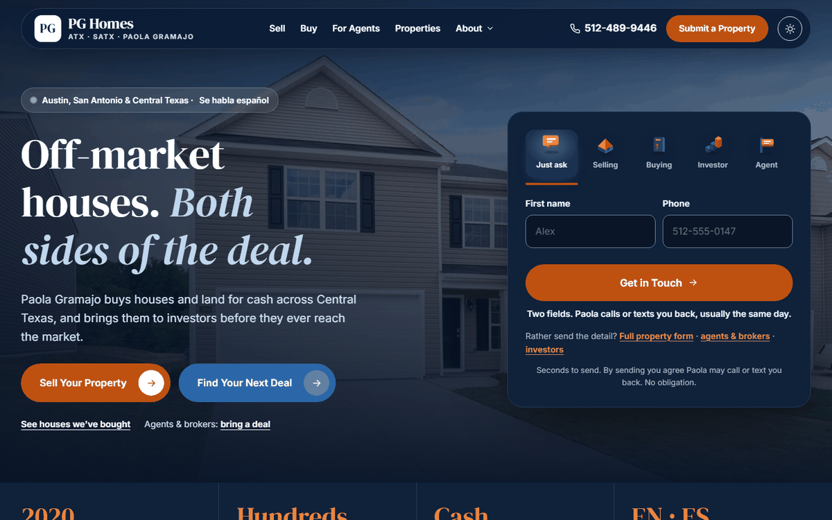
Paola Gramajo buys houses and land for cash across Central Texas and brings them to investors before they reach the market. We built her a ten-page website at cashbuyertx.com that gives sellers, investors and agents each their own way in, with a two-field form on the first screen.
No contract. No exit fee. Your domain and Google accounts stay in your name.

Paola has been buying Texas property since 2020. She works both sides of a deal: she buys houses and land from owners who want a simple cash sale, and she brings those properties to investors who want them before anyone else sees them.
That makes her website harder than most. A seller with an inherited house, an investor with cash to place, and an agent with a listing that won’t move all land on the same home page, and each one needs a different next step.
One website, three kinds of visitor
Most real estate sites talk to one person. Paola’s has to talk to three, and each wants something different.
- Sellers want a straight answer on a house that needs work, without repairs, showings or commissions.
- Investors want off-market deals that match what they buy, without fighting over a public listing.
- Agents and brokers want a quick yes or no on a listing that won’t sell the usual way.
If the home page tried to say all of that at once, nobody would know where to click. So we gave each visitor their own door.
What we built
A new site at cashbuyertx.com under the name PG Homes. Ten pages, and each one has a job.
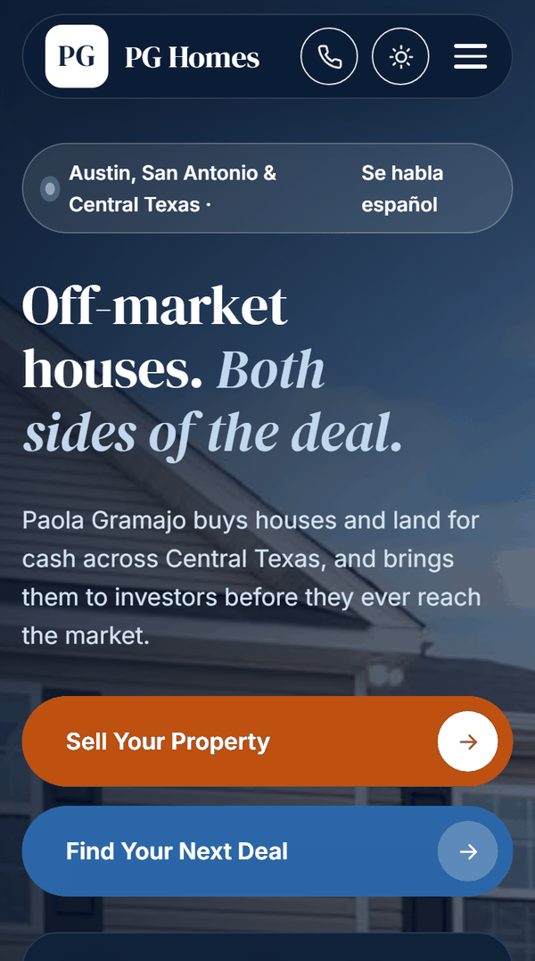
- Two doors on the home page: “Sell Your Property” and “Find Your Next Deal”, plus a third for agents and brokers.
- One form, five audiences. Tabs across the top: Just ask, Selling, Buying, Investor and Agent. The fields and the button change with the choice, and each page opens on the tab that fits it.
- A two-field way in. “Just ask” wants a first name and a phone number, nothing else, and it’s the default. Nobody faces a long form before they’re ready.
- A buy box for investors. They tap what they buy, where, and how much work they’ll take on, so Paola only sends them properties that fit.
- A property path finder for anyone unsure which door is theirs: a few quick questions point them to the right page.
- A page for each side of the deal: Sell, written around “sell my house fast as-is”, and Buy, written around off-market investment property in Austin. Plus For Agents and a traditional agent service.
- A real map of the Austin to San Antonio corridor on the Where We Buy page, built from OpenStreetMap data.
- An assistant that answers common questions at any hour, then hands over to Paola. Every answer is written, not generated, so it can’t say anything she wouldn’t.
- Spanish speakers welcome: “Se habla español” up top, and Paola replies in English or Spanish.
- Light and dark mode, with every piece of text passing the contrast standard in both.
Every enquiry reaches Paola in seconds
There’s nothing for Paola to log in to. When someone fills in a form, it lands in her email within seconds, labelled seller, buyer, investor, agent or just asking, and a copy is saved in a Google Sheet so no lead gets lost.
- Tap to call or text on every page.
- Every form ends with a link to the other routes, so an investor who landed on the Sell page never has to start again.
- Old addresses still work. Three links from her earlier pages forward to the new ones, so nothing anyone saved goes nowhere.
Fast on a phone
People selling a house often look on their phone, sometimes standing in front of the house itself. So we tested the site the way Google does.
| Phone | Computer | |
|---|---|---|
| Performance | 97 | 100 |
| Accessibility | 97 | 97 |
| Best practices | 100 | 100 |
| SEO | 100 | 100 |
Scores from Google’s free PageSpeed Insights test. You can run it on the site yourself, and the numbers move a little from test to test.
Nothing jumps around while a page loads: the layout shift score is 0.00 on phones and computers. Photos lower down only load when you scroll to them, and on the Properties page only the view you’re looking at downloads.
We also loaded the Sell page the way a phone does, with nothing saved from an earlier visit. It downloads 14 files and 0.68 MB, so it shows up fast even on a weak signal.
Built for Google and AI to read
Every page carries structured data: labels in the code that tell search engines and AI assistants who Paola is, what she does and where.
- All ten pages carry the business details: Paola, the phone number and every city and area she serves
- 44 questions answered and marked as FAQs on nine pages, so the answers can show up in search and AI results
- A unique title and description on every page, link previews for social media and texts, and a breadcrumb trail on every inner page
- Secure https on every address, with Texas Real Estate Commission notices in the footer
What happens next
The site went live in October 2026, so it’s too early for lead numbers. We’ll add them here once there’s a full month of data.
Next: real photos on the Properties page as Paola sends them, a review after every closing, and a Google Business Profile with the same name and web address as the site.
Questions about this project
How many form fields should a real estate website have to get more leads?
As few as you can get away with. Every extra box makes some people give up before they press send. On PG Homes the first form asks for two things, a first name and a phone number, because that is all Paola needs to call back. Anyone who wants to send the full property details can open the longer form.
Should a cash home buyer website have separate pages for sellers and investors?
Yes. Sellers and investors want opposite things: one wants a simple sale, the other wants the next deal. Mixing them on one page asks both the wrong questions. PG Homes has a Sell page and a Buy page, each with a form that opens on the right tab, plus a page for agents.
What should a “we buy houses” website include to get sellers to call?
A clear promise in the first screen (cash, no repairs, no showings), a short form right beside it, a phone number you can tap, the steps of a sale in plain words, proof of houses already bought, and straight answers to the questions sellers worry about. If your market speaks Spanish, say so up top, the way PG Homes does.
How do I get investors to join my buyer list from my website?
Make it quick and make it pay off for them. On PG Homes, investors tap what they buy, where, and how much work they will take on. That buy box travels with the form, so Paola only sends them properties that fit, which is the reason to sign up.
How fast should a real estate website load on a phone?
Aim for 90 or more on Google’s free PageSpeed Insights test on a phone. Speed feeds into search rankings and into what Google Ads charges you. The PG Homes home page scores 97 on a phone and 100 on a computer.
How much does a real estate investor website cost?
It depends mostly on the number of pages. A ten-page site like PG Homes, with a page for each type of visitor, sits in our Business website package at $2,995, paid once. Ongoing SEO to get it found is monthly, from $395 a month. Every package and plan is on our pricing page.
Abdullah Mahdi
Founder of Visible Owl. Leads SEO, AI search (GEO and AEO) and website development, and has built and ranked websites for small businesses since 2015.
Sources
Want more answers like this?
Add Visible Owl as a preferred source on Google, and our articles show up more often in your Top Stories and AI answers.
Button not showing? Add Visible Owl on Google.